|
|
| |
|
 |
PrintShop LiveMail is an authoring tool with advanced animation features and a unique visual interface that allowed novices to create mini movies for the Web. The animation tool included innovative features for its time, such as: a non-linear motion path for media items (animation, image, text) with editable points, an internal scripting language that gave users the ability to create interactive events and a Java applet that could play the animation in any browser (back at 1997 it was an uncommon feature).
Users could customize and create unique interactive animated cards in few minutes, using ready made materials for the visuals and sounds and editable texts for verbal content creation, and then email the cards over the
|
|
|
internet. The product was developed at the Zapa Digital Arts development center in Tel-Aviv in 1996-1997, and bought and distributed by Broderbund Inc., one of the biggest educational software companies at that time.
DESIGN ISSUES
The product was targeted at teenagers and young adults, who would use it to create their own greeting cards, party invitations, events announcements etc. Our basic assumptions were that:
- No background in animation or graphic creation was needed
- The creation of the card should be a fun and creative experience
- Sending and receiving the greeting card should be very easy
According to these assumptions we have defined some basic principals for the design of this software:
- The Interface should be easy-to-use and supportive - creating a sheltered environment for the inexperienced but creative users.
- Non-standard GUI components that fit specifically to our needs.
- Advanced 2D animation and interaction features, so users have the freedom to bring their ideas and stories to life.
- A library of pre made media items and complete greeting cards, so users do not need to know how to create a digital image, an animation item or a sound effect.
- Support of a standard web run-time format, so users can send the cards by email, and their recipients can view it in their web browser (no heavy attachments).
- A friendly and appealing look and feel - create the feeling of a playful environment.
APPLICATION GUIDED TOUR
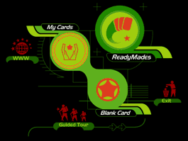
The opening screen
The opening screen allows the users to choose their work path in the application:
- Ready-mades – Takes the users to a library of completed cards, divided to categories where they choose a card to personalize.
- My Cards – The user opens an existing, saved card.
- Blank Card – Takes the users to the studio area where they can build their own card from scratch
- Guided Tour – Takes the user on a tour of the application screens and features.
|
|
|
|
|
This is the work space in its primary form:
an empty meditation space |
|
| |
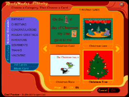
The ready-made cards Library
|
|
The ready-mades library is a good starting point for inexperienced users.
This library of 200 pre made greeting cards, enables the users to pick a card, explore it, then use it as is or customize it anyway they want.
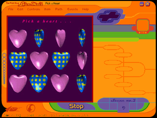
The cards are built from several scenes and the user can change each of the elements it’s comprised from, including: animation, images, text, sound, background images and borders |
|
| |
the studio

|
|
The creative activity takes place in the
studio. Here the user can either modify an existing card or create
their own from scratch.
The Studio has several areas:
1. The stage: this is the card’s composition area. Items are added to, modified in and deleted from the stage.
2. The ADD items button: Opens the different media libraries through which the user adds items to the card
3. The properties area: displays the selected items properties, and enables their modification.
4. The card navigator area: Contains Play control buttons and Scene information.
5. The card weight indicator: Indicates weather the card is heavy (when the gauge is full and red) or light weighted (when it’s empty and green).
6. The Send button: when work is done – it’s time to send the card.
|
|
| |

|
|
A basic behavior principal we defined was
that the interface items always respond to the user’s mouse location, change accordingly, and offer more possibilities. Most of the mouse-over states reveal more action options – this way we could keep the interface “clean”, and yet maintain all needed functionality, as well as provide a clear focal point for the user’s attention.
For Example: see the different states of the properties slider: Non existent, Disabled, Enabled and Active
|
|
|
Card creation process
A card is comprised of one or more Scenes, each scene is a short movie that contains various media items. The scenes can follow each other in a linear manner or be reached by pre-defined interactions.
The card creation takes place in the Stage area where users can add media items, create motion paths, add interaction scripting, edit items properties, play the card and more.
|
|
|
Adding items to the card

|
|
The user adds items through the media libraries.
As a support to the creative process we have designed the libraries as a Visual Search Engine, an invention which was later patented. |
|
|
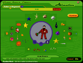
The Visual Search Engine
The Visual Search Engine (VSE) is a system that allows users to search for media items (animation, image, text) in a visual, associated way.
The idea is to mimic a brainstorming process or any other creative process, where the end result is different from what you thought you are looking for at the beginning.
Many people know what they want and like, but don’t always know how to express it. To assist them, and break “creative blocks” we gave them the opportunity to go farther from their rational choice (the one they can express) to an intuitive one (what they really wanted, but didn’t know how to ask for).
The Concept
Direct keyword search that leads to an associated search. The VSE works both in the logical and intuitive levels:
|
|
|

|
|
1. Logic: Direct Keyword Search.
First - a direct keyword search is done, to identify an item based on the keyword the user enters.
In this example, the user looks for the keyword - 'fly' (note - an ‘auto-complete’ feature completes the user typed words, assuring that the keyword exist in the database).
The results are presented. The item in the center is the selected item. The user can hover with the mouse above it to see the animation running.
|
|
|

|
|
2. Intuition: Associated Search
Then the associated phase begins. The user can hover with the mouse above any item to see its animation running. One click on any of the items, and the screen re-arranges with the selected item in the middle, and new items around it based on the Association Algorithm. This way the user sees a large variety of items every time, and can look for items in an associative way rather then by searching directly |
|
|

|
|
|
|
|
How it works
The algorithm scans the entire database for items that are ‘associated’ to the center item. ‘Associated’ means that they have more then one keyword in common with the selected item's keywords. The items that have more keywords in common with the selected item are presented near the center item; items with less common keywords are presented far from the center. Those items do not necessarily have the keyword 'fly' in their keyword list.
|
|
|
Random
|
|
An extra “creative block breaking” feature was added:
“Random” button that would display an assortment of images for the user to choose from, or to use as a starting point for a new associated search
|
|
|
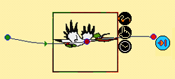
After the media item was added it is used in the card’s creation. It can be manipulated and its properties can be edited:
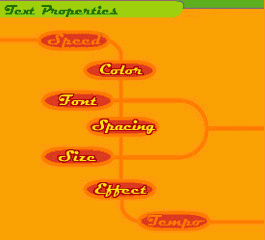
Text Item – Movement speed on Motion path, Font, Size, Color, Style, Spacing and effect. Text Effects are animated effects like ‘typewriter’ or ‘nervous’.
Image Item – Movement speed on Motion path.
Animation Item – Movement speed on Motion path and animation tempo (the frame rate of the animation item).
|
|
|
real-Time WYSIWYG editing
|
|
The real-Time WYSIWYG editing mechanism turns the card creation and editing process into an intuitive and immediate experience.
For example: Media item properties can be edited in real-time in the studio, using the sliders components. The sliders allow users to edit item properties in a visual way by dragging a graphic slider to the right or left
|
|
|
real-Time WYSIWYG editing
|
|
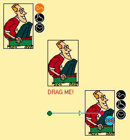
Each media item on the stage is compound from two elements:
1. The media content : Text, Image or Animation
2. The bounding box: contains the media item attributes, and has three interaction buttons attached to it: Add Motion Path, Add Click Event, and Add Timed Event.
User can change the content of the bounding box (replace “cow” animation with “Stork” animation), but still keep its attributes (I.E.: it will keep the same motion path).
|
|
| |
Motion Path
|
|
Every item can be moved across the stage using a motion path. To create a path the user clicks on the ‘motion path’ button and drags the items across the stage.
The path is automatically created, recording the exact curves the user has made. The path has editing points that can manipulate the path at any point. Points can be added or removed. When playing the card, the item will move on its motion path. Users can edit the speed of the item and the behavior at the end of the path (loop, reverse, stop). |
|
|
Click-triggered Events
Users can add an event that will occur when the card recipient clicks on a specific item. The script is added through an extra easy interface. The user selects the item he wants to assign the event to, then clicks on the ‘click event’ button (attached to the item), then selects the desired event from the ‘Events Window’ – that's it. The event is automatically scripted and assigned to the selected item.
Timed Events
Users can add an event that will occur at a specific point in time after the card has started to play. To set a new timed event, the user plays the card, stops it exactly at the point he wants to add the event, then he selects any visible item, clicks the ‘timed Event’ button (attached to the item) and the select the desired event from the ‘Events Window’. The event is automatically scripted and assigned to the selected frame
|
|
|
Users can select any of the following events:
- Add text – adds a new text item to the stage. The text window is opened so the user can create the new text.
- Add Image – adds a new image item to the stage. The Image Library is opened so the user can select the new image.
- Add Animation – adds a new animation item to the stage. The Animation Library is opened so the user can select the new animation.
- Play Sound - adds a new sound. The Sound Library is opened so the user can select the new sound.
- Stop Sound - stops a sound that is supposed to be playing at that point. The 'Active Sounds' window is opened so the user can select the sound to stop.
- Replace Image - replaces the bitmap of a specific image with a new image. The size does not matter. The Image Library is opened so the user can select the new image.
- Hide Item(s) - Hides a specific item or items that suppose to be visible at that point. The 'Visible Items' window is opened so the user can select the items to hide.
- Show Item(s) - Shows items that were hidden before.
- Freeze Animation - Freeze an animation item, so it appears as an image.
- Resume Animation - Resume playing an animation after it was freeze.
- Go To Scene - create a new scene and connect it to the current scene, at the current event. The new scene will be visible when exiting the 'Events Window'.
- Go To URL - when the card will be played over the Internet, this event will open the Web Browser in the desired URL.
- Change Background Color - Change the color of the stage (only for the current scene)
THE OUTPUT
The animated cards created with LiveMail can be easily viewed on the Web. In order to play the animated cards over the Internet, we have developed a Java applet that played any LiveMail card. Both Internet Explorer and Netscape navigator are supported.
Sending a card with the 'send by email' feature - The recipient receives an email from his sender, with a URL. To view the card, the recipient clicks the URL and the card starts to stream and play inside his Web browser.
Back to top
|
|
|


